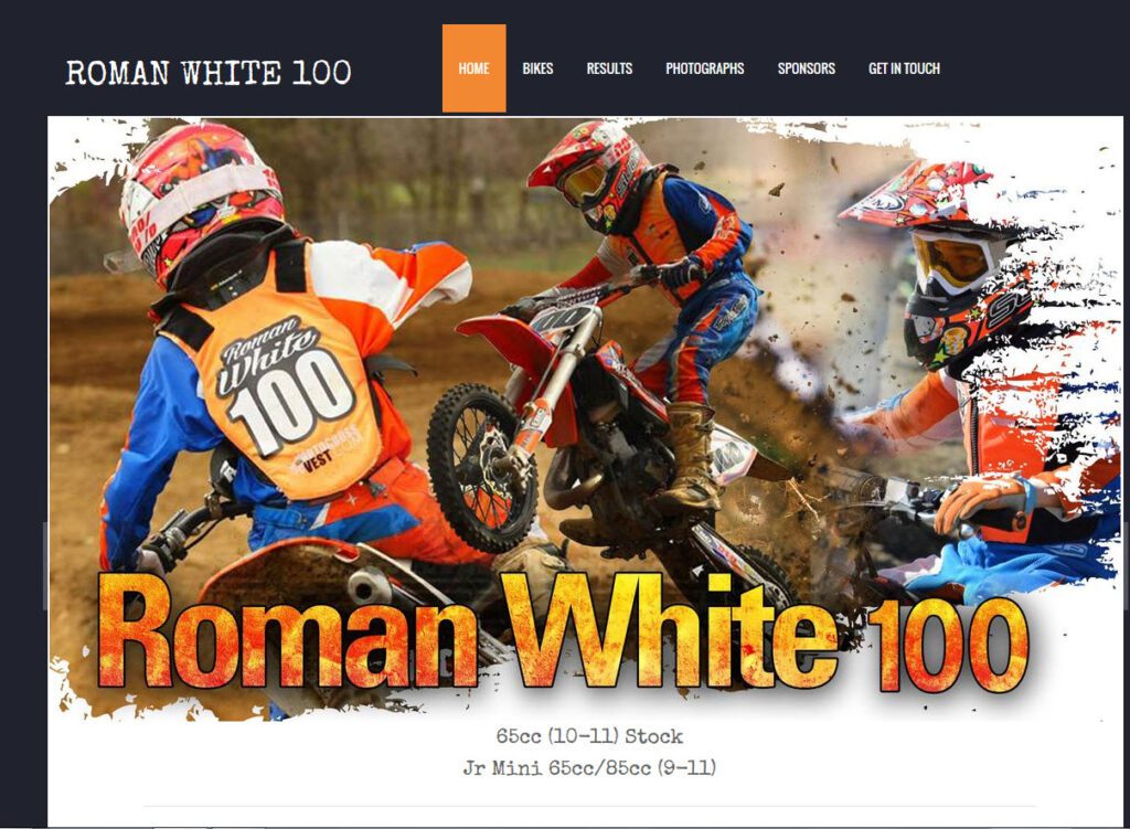
In this quick tip, I want to touch on a racer branded website.
In the future, we’ll get into more behind the scenes building and content creation, but for this post, I wanted to call out and send props to a particular riders site.
It’s the site for NJ mini bike racer Roman White. RomanWhite100.com
The site is simple, professional and clean and gives you lots of information about this young athlete.
It features organized pages for Bikes, Results, Photos, Sponsors and Contact, and each page is consistent with the overall theme of the rest of the site.
For those of you are looking to create a website of your own, this would be a great place to start as I would only offer a couple of suggestions to improve upon an already excellent presentation.
- Add an About or Bio page, one that could tell us more about this young racer and his aspirations.
- Adjust the bike page to include images of the bikes with a list of the modifications made. Perhaps a link to sponsor website for the items they provide.
- Links to the sponsor website on the sponsor page. Perhaps even with embedded Google Analytics information so you can show your sponsor what you sent to their site.
- A place for social accounts. (This may not be appropriate for younger racers without parental supervision)
- Press and media. Use this page to show where you’ve been in the paper or featured online.
Aside from a couple of simple tweaks, I believe this is a fantastic job at representing a racer and an excellent tool to show value to a current or potential sponsor.
Well done!
EDIT- Thinking of creating your site but don’t know where to start? Here is a post from Lifehack.org that might help you out. 5 Tools to Create a Professional Website for Free.
If you are interested in my suggestions to make your site better, please let me know. I’d be happy to offer constructive criticism and suggestions based upon my years of industry experience.
Thank you


